Why Designers Shouldn't "Fix" Other Designers' Logos
I once had a design student read this post, and mistakenly think I was advising them against redesigning logos in an academic context. Far from it; redesign can be an excellent creative exercise for students. This post is about the rather toxic habit some in the design community have of spending a day (or an hour) tweaking a logo or brand and calling it “better.”
Earlier this week, Google unveiled their new sans-serif identity, ditching the familiar serifs for which the company has been known since its inception for a cleaner, simpler look:

Among the population in general, and particularly among designers, reviews have been mixed. Some herald this as a fresh new direction, perhaps the emblematic tech company boldly being unafraid to leave behind the conventions of the past to embrace the present and future. Others…well, others thought it might have been better.
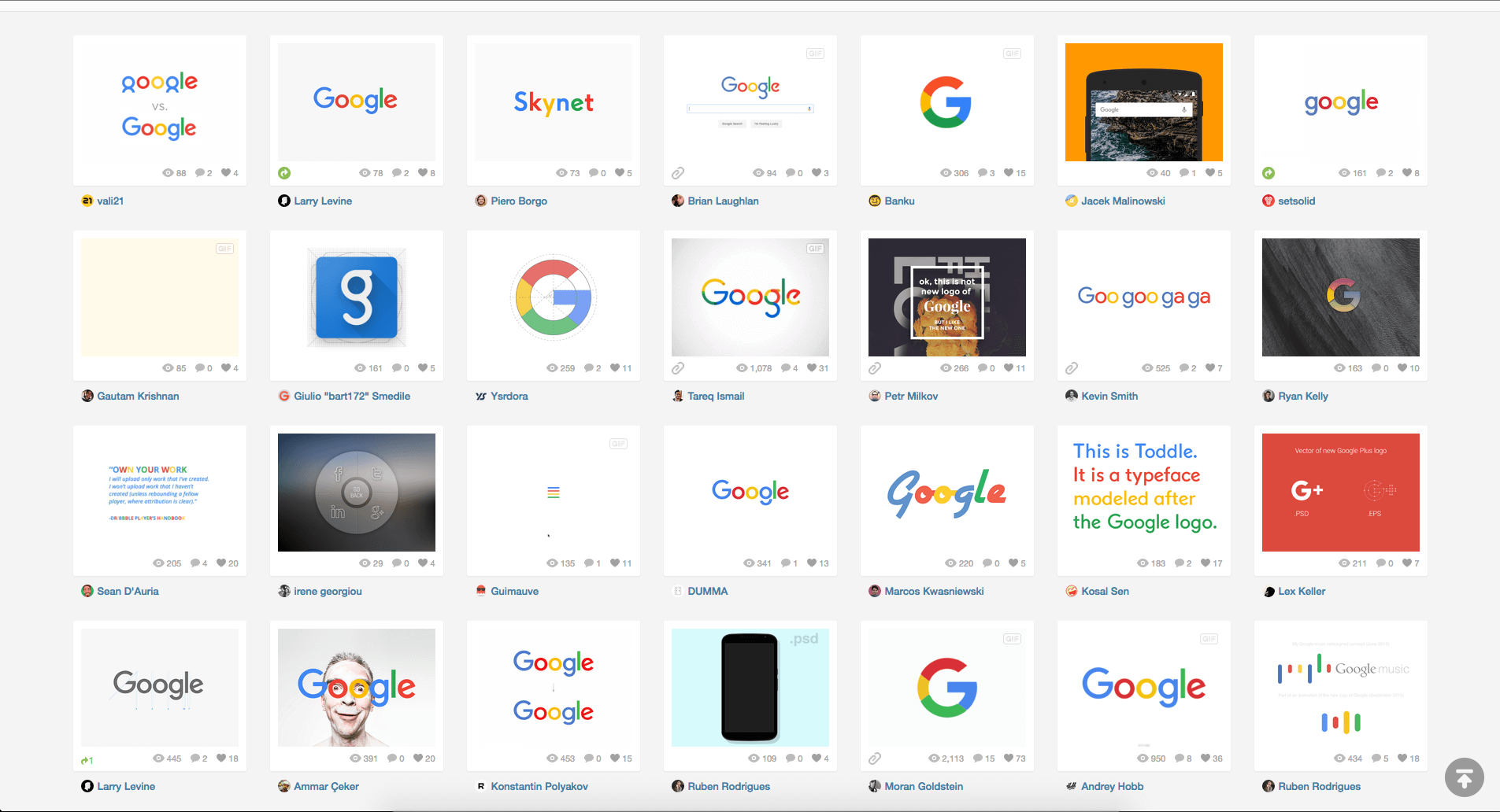
That’s an understatement, really. Barely 48 hours had passed since the announcement when, with a cursory search of the word “Google” in Dribbble, I came upon pages and pages full of graphic designers posting their ideas for a “fixed” or “better” version of Google’s new logo. Here’s just a small glance at everything that was out there (believe me—there were hundreds more, and again, this was less than two days after the new identity system was announced):

To say that this behavior was limited to Dribbble would be inaccurate. The announcement was made on Tuesday, and before the day was even over there were slews of articles, some thousands of words long, popping up all across the internet, many of which filled with righteous indignation over Google’s decision to go with something so supposedly unoriginal, plain, radically different, or just bad (in the opinion of the writer, of course).
Accusations cropped up. Some said Google had copied their new logo from an old Gymboree mark (as though two colorful sans-serif capital Gs ought to look unmistakably distinct):
Others accused Google of simple unoriginality (as though a few cherry-picked modern sans-serif logotypes wouldn’t look similar when they’re all shown side-by-side in black):
#creative pic.twitter.com/u9ScnzwCbC — Ramin Nasibov (@RaminNasibov) September 2, 2015 While still others thought it was just plain poor, like this typographer.
In the case of Google, I’d like to go on a small tangent and point out that Google is really playing their own game here. In terms of identity, their needs are radically different than pretty much any other company on Google Earth. They don’t really have competitors, at least not like most brands do. Sure, there’s Apple and Microsoft, but for the most part, Google has already won every game it’s playing. Google is the 800 lb. gorilla; it sits wherever it wants. It doesn’t need to worry much about being confused with, or looking worse than, any another company. Short of Google changing their logo to, say, a swastika, people aren’t going to stop using Google products. We’re still going to use google.com for searching (which everyone will still call “Googling,” even if it’s not technically accurate), we’ll still use our gmail accounts, we’ll still look to Google Maps any time we need directions somewhere, and on and on. Even the least plugged-in among us probably still has their life impacted by Google a dozen times a day.
So in terms of branding, Google doesn’t really have to listen to anybody, least of all an upset designer on the internet.
But tangent aside, and not specific to Google: any time a new design comes out, there is bound to be discussion about whether or not that new design—pardon the pun—misses the mark. Sometimes this discussion will be heated. Sometimes it will even become such a cacophonous outcry that the brand behind the design decides it might be best to take a step back. (Gap, anyone? For the record: I don’t think it was as bad as everyone else did. So the aborted logo redesign was plain. What is Gap, exactly? Gap sells khakis and business-casual button-ups. If that’s not Helvetica in clothing form, I don’t know what is.)
I’m not necessarily saying Google’s new logo is the greatest thing ever (though that’s beside the point: Google’s problem wasn’t that they needed the greatest logo ever; their problem was that they needed a unifying identity system, and that problem has now been solved.) And I’m not saying all the feedback that emerged from the design community was unwarranted or inaccurate. That typographer above makes some reasonable points. Many designers did.
But the problem was, they made these points and registered these reactions instantaneously and without regard for what makes graphic design more than subjective window dressing: the how and the why.
Emotion vs. Thought
Graphic design is a tricky thing. It’s both art and science, subjective and objective. It’s part left-brained rationality and part right-brained creativity. It’s a merging of thought and emotion. And this is what makes reacting to graphic design such a careful balance of immediate reactions and delayed reactions.
When we present designs (and especially redesigns or entirely new names) to clients, we always tell them: register your immediate reactions, think about them and remember them. But don’t put too much weight on them and don’t let your immediate reaction kill an idea before it’s had a chance to grow on you, because—and this is important—the human brain is wired to reject things it isn’t accustomed to.
You know why movie sequels are so popular? Because people want things that are new, but they don’t like things that are unfamiliar. So it is with design; we say we want things to look fresh and new, but our brains really don’t like anything we’re unfamiliar or uncomfortable with. It’s just part of human nature. That’s why we lash out at new logos and new identities; like it or not, no matter how consciously aware we are of it, there’s an animal part of our brain that screams out “I don’t like it!” like a toddler refusing to try a new food.
But fortunately for our primitive brains, time changes perception. We all have things we didn’t like at first but grew to love as we came to understand them better. (For me, pretty much every one of my favorite albums is one that I didn’t like at all on first listen, while most of the albums I loved right off the bat I now find completely uninteresting.) Every time Pepsi changes their logo it seems like a radical shift for a little while, but before long, it looks weird when you spot the last version in the background of a movie.
We’ve all tried something we hated at first or met somebody we didn’t like at first impression, only to realize over time that either we were wrong, our perceptions were wrong, or we’ve actually changed. Design requires this type of delayed reaction. It requires you to live with it and get to know it on a deep level, not just a surface emotional reaction.
Emotion screams out at first impression. It’s irrational and unhesitant, but it’s fast. Thought takes time. It’s careful and logical, but it doesn’t happen quickly.
And that’s one reason why you shouldn’t be writing scathing blog posts about new logo designs or remaking them to “fix” them within the first hours of their existence. But there’s another, more important one:
The Message You’re Sending
Even if you were able to immediately and completely process a new design at first glance and be ready to write a comprehensive blog post about it on first impression (and just to reiterate, you can’t. But even if you could), there’s still a good reason why you shouldn’t.
If you’re a designer, you undoubtedly tell your clients the same thing you were told as a design student, namely: no matter how simple the end product, design is hard work, and aesthetics aren’t the whole point. To come up with something that looks good, something somebody likes, is at best tangential to the main point. We’ve all chanted the mantra a thousand times: design is about more than appearances. It’s about problem solving and communication. And problem solving and communication generally require days, weeks or maybe even months of intensive research, ideation, brainstorming, creation and revision.
Whether the result of real problem-solving design work is something anybody likes is beside the point. The question is, does it succeed at meeting the project goals? Does it solve the problem?
And you don’t know the answer to that question.
You didn’t see the brief. You weren’t there for the meetings. Odds are that you have only a casual knowledge of the client in question. You didn’t see all the ideas that were pitched and you weren’t part of the discussion on why some failed and others succeeded. You didn’t weigh the advantages and disadvantages of this color or that font. You didn’t present the final iterations, you didn’t hear the client’s feedback, and you didn’t have to find a way to merge each and every last one of those requirements and limitations into a single, cohesive entity.
That gives you absolutely no right to critique anything except the subjective aesthetics of the design you’re seeing.
And I’m willing to bet money that you hate it when somebody does that to your design.
“Well, sure I wanted to change this, but the brief required…”
“Yeah, I would have liked to explore typefaces more, but the budget…”
“This color definitely wasn’t my first choice, but according to our audience research…”
These are all sentences you can’t hear because you get the luxury of seeing the final product without any knowledge whatsoever of how it came into existence. Remake somebody else’s logo design all you want, but know that it’s utterly meaningless, because you get to do whatever you want and the original designer didn’t. They had deadlines, budgets, parameters, meetings, goals, briefs, revisions, concerns and loads of client feedback. All you have is a starting point that somebody else already created for you and a social platform full of people willing to click the “like” button.
Remaking somebody else’s logo without knowledge of the full process behind it isn’t design; it’s practice at best, and doodling at worst.
Don’t Cheapen Design
Taking somebody else’s work and toying with it is a fine exercise for somebody who’s learning. But it’s little more than plagiarism if you’re telling an audience that this, in terms of real design, has any substantial meaning or value whatsoever.
When you show the world that you can supposedly take something existing and make it better in a single day, the message you’re sending is, “design is effortless. It takes very little time, thought or energy. It’s cheap, petty, subjective and shallow.” You strip design—and every other designer out there—of their value and the respect that they deserve.
Don’t do that. Don’t cheapen what we do. Don’t give the world the message that what we provide is easy, quick and mindless.
Design, at its best and as it ought to be, is absolutely none of those things.