Let's Learn CSS Variables!
The usefulness of CSS variables should be fairly apparent if you’ve managed any sizable stylesheet before. If you have, you probably already know how untidy it can be at large scale. In fact, that’s one of the biggest knocks against CSS; it’s very easy for a stylesheet to balloon, making updates difficult as you’re forced to search through hundreds (or thousands) of lines of code to make changes.
Fortunately for us, browsers are always adapting newer and better ways of doing things, and so we get an awesome, fairly new feature called CSS variables!
(Pedantic side note: technically, these are called “custom properties.” But that’s boring, not as clear, and honestly a less common name than CSS variables. So I’m gonna stick with the latter.)
The Old Way
To demonstrate what CSS variables are good for, let’s take a common example: you’re managing a robust stylesheet for a client, and their brand color is used all over the place. It’s in buttons, borders, backgrounds, text colors, and all kinds of other places, something like this:
h1 {
	color: #ffd100;
}

button {
	background-color: #ffd100;
}

input {
	border: 2px solid #ffd100;
}
And so on and so on. Eventually, though, your client decides that this is not the proper color, or rebrands, or for whatever other reason, this color needs to change and be updated everywhere it exists on the website.
That’s obviously a huge pain, because you’ve got to do a large-scale find-and-replace now. With some text editor know-how, it’s not too big a deal, but things can be missed or even changed when they weren’t supposed to be if you’re not careful, especially when dealing with multiple stylesheets (or, *shudder*, CSS outside of stylesheets).
Fortunately for us, this is the black-and-white part of the infomercial where the poor, hapless CSS author says “there’s got to be a better way,” and the announcer cheerfully replies, “well, now there is!” as the world bursts into color. Enter CSS variables!
CSS Variable Basics
Rather than using the same value over and over again (making it tough to manage and update your stylesheet), a CSS variable allows you to simply set a name for any given value. Then, whenever you want to use that value (in this case, our specific color), you put the name in your stylesheet, rather than the actual hex code. The name is essentially an alias or placeholder for the color; a reference back to the original setting.
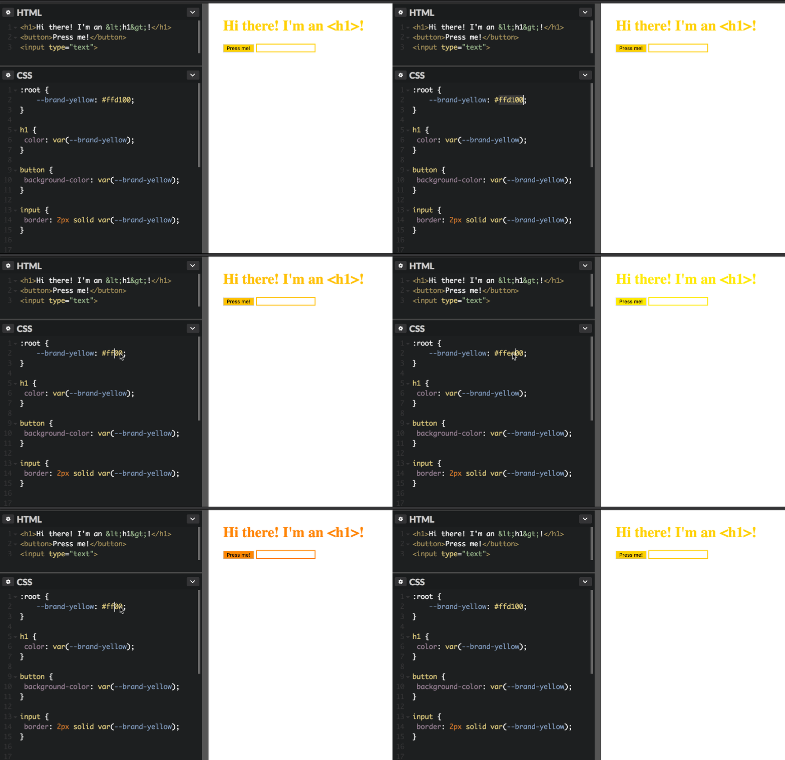
Then, if you ever want to change the value, you only need to update it in one location; everywhere else updates automatically!
But instead of talking about it, let me show you how you might use it:
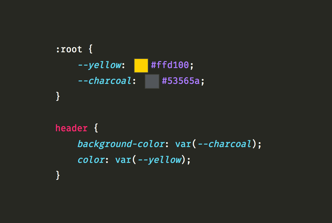
:root {
	--brand-yellow: #ffd100;
}

h1 {
	color: var(--brand-yellow);
}

button {
	background-color: var(--brand-yellow);
}

input:focus {
	border: 2px solid var(--brand-yellow);
}
Whoa! That might look like a lot of new syntax, depending on your current familiarity with CSS. And some of it is brand new, so let’s break it down piece by piece, starting at the top.
Putting Together the Pieces of CSS Variable Syntax
What is :root?
You might not have used the :root CSS pseudo-class before, but it refers to the topmost element in the HTML document. In a webpage, this will always be the <html> element, and in fact, the :root selector is pretty much the exact same as the html selector. (The only difference, for those curious, is that :root is slightly more specific. So if you used both selectors, the styles applied to :root would take precedence.)
That explains what :root is, but not why. Why are we putting variables in a rule targeting the :root? Turns out, there’s a very good reason for this, and it is: the cascade.
Remember, in CSS, everything trickles down the cascade, and elements inherit properties from their parent and ancestor elements. So the reason we define CSS variables inside the :root selector is that we want them to cascade down, and be “known” to every other element in the document to use as needed.
In other words: applying a style to the :root means it gets “passed down” to every other element in the document. This wouldn’t be the case if we applied CSS variables to, say, a random <div>. Elements inside that <div> would know about the variables and could use them, but no elements outside would. So it makes the most sense to apply CSS variables to the :root pseudo-class, since everything is inside of the root tag, which is <html>.
What does --brand-yellow mean?
In the example above, I’ve named my CSS variable “brand-yellow,” but there’s nothing special about those words. You can actually name your CSS variables anything you want to! (I’d recommend something intuitive, though, so that when you or anybody else comes across the variable in a CSS file, its name will confer its value and purpose. Variable names like --myVariable or --x aren’t very helpful or descriptive.)
The only special part is the double dashes (--) before the variable name. Browsers have decided that these dashes are how we must name our variables, to indicate that they are different than normal CSS properties.
So you could name your variable something like --myYellow or --brand-orange or --em or anything you want!
And by the way: variables can be anything, not just colors!
If you have a particular unit of measurement you’re using over and over again—say, for example, 16px—you could set a CSS variable for it, and use it anywhere you need!
:root {
	--unit: 16px;
}

header {
	padding: var(--unit);
}

h1 {
	margin-bottom: var(--unit);
}
And so on. Anything that can be a CSS value can be a CSS variable! So if you’re repeating it often, it may be worth setting a variable for it. That way, if you decide to change all of those instances—if 16px needed to change to 18px, for example—you only need to make the change in one place!
What’s with var()?
Those of you who have worked in pretty much any common programming language will recognize that var() is a function. (And for those of you who aren’t familiar with functions, don’t worry: this one’s very easy to use.)
As you probably guessed, “var” is short for “variable,” and the var() function is how you actually use those values you set up in the :root element. Just insert the var() function, and put the name of whichever variable you’d like to use inside the parentheses. Easy as that!
Once more, let’s have a look at the whole thing put all together in a new example:
:root {
	--base-size: 18px;
}

p {
	font-size: var(--base-size);
	margin-bottom: var(--base-size);
}

header {
	padding: var(--base-size);
}
In the above example, we’ve got a --base-size variable set to 18px, and our <p> elements will use it as both their font-size and their bottom margin. Plus, it will be the padding measure used by our <header> element. And if we ever decide that’s too much or too little, all we need to do is update the value of the variable where it’s declared in the :root, and all changes will be made together quickly and neatly!
A Couple of Fancy CSS Variable Tricks
Using CSS Variables with calc()
You might be familiar with another of CSS’s (few) functions, calc(). The calc() function (short, fairly obviously, for “calculation”) allows you to have CSS do math that would otherwise be impossible in the language. Here’s a basic example of calc() in action:
.container {
	width: calc(100% - 32px);
}
That bit of CSS sets elements with the .container class to be 100% wide, but then subtracts 32px from whatever that total may be (probably to account for 16 pixels of padding or margin on each side of the element).
Mixing units of measurement like this—units such as % and px (or even vw or vh)—is one of the things calc() is really useful for.
But what does this have to do with CSS variables? Get excited: we can do a little CSS function inception to use CSS variables inside of a calc() function!
Feast your eyes on this example CSS:
:root {
	--base-unit: 16px;
}

.container {
	font-size: calc(var(--base-unit) * 1.2);
	padding: calc(var(--base-unit) * 1.5);
	margin-bottom: calc(var(--base-unit) / 2);
}
Nifty, huh? By using calc( var(--base-unit) * 1.2), we’ve had CSS take our --base-unit variable (which, remember, is 16px) and multiply it by 1.2—resulting in a font-size of roughly 19px. The padding is 1.5 times our --base-unit variable, resulting in a value of 24px, and the bottom margin is the variable divided by two, thus, 8px.
Another example I really like: resizing CSS grid columns individually. Ordinarily, to redefine one column in your grid, you’d need to rewrite the whole rule, but with CSS variables, you can reach in and adjust at will without touching what you don’t need to:
/* Set the default styling for the .grid class */
.grid {
	--left-column: 1rem;
	display: grid;
	grid-template-columns: var(--left-column), 32rem, 1fr;
}

/* Make the left column wider at certain breakpoints,
   without touching the rest of the grid. /*/
@media (min-width: 768px) {
	.grid {
		--left-column: 2rem;
	}
}

@media (min-width: 1200px) {
	.grid {
		--left-column: 4rem;
	}
}
Are you excited? I’m excited.
Redefining CSS Variables with Media Queries
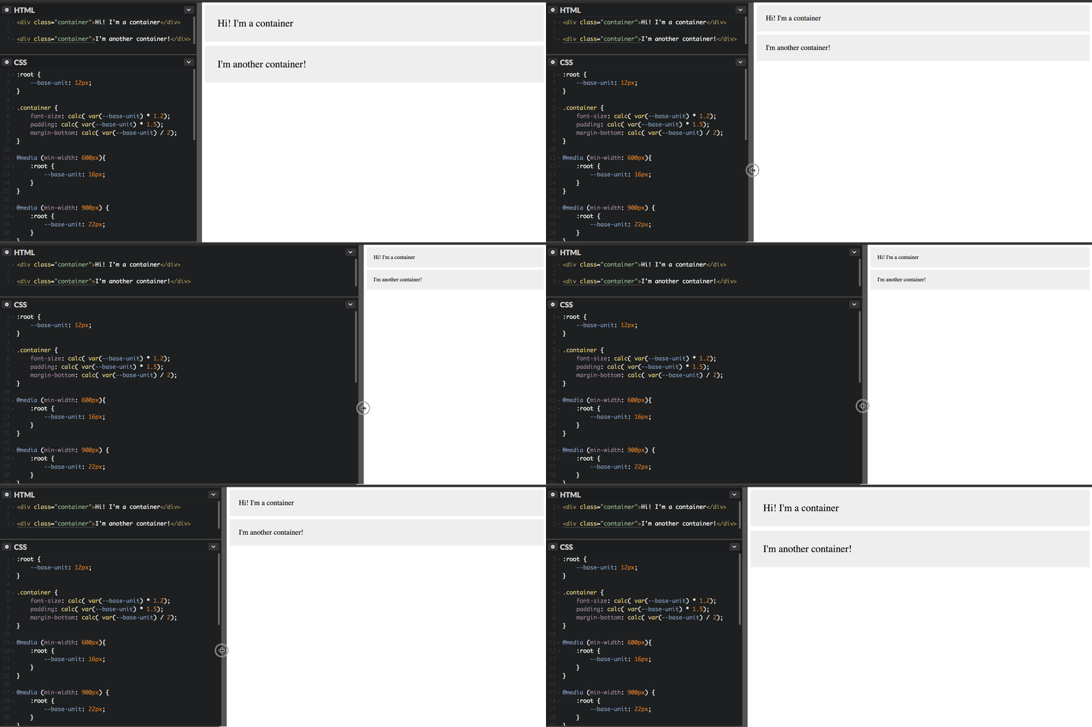
Let’s keep using the example above; 16px might be a suitable unit of measurement for some screens, but we might want it to grow or shrink depending on the screen size. Easy! Just use a media query:
:root {
	--base-unit: 12px;
}

@media (min-width: 600px) {
	:root {
		--base-unit: 16px;
	}
}

@media (min-width: 900px) {
	:root {
		--base-unit: 22px;
	}
}
You can’t tell me that’s not cool (and much easier than updating each of those values individually at every breakpoint)!
Browser Support
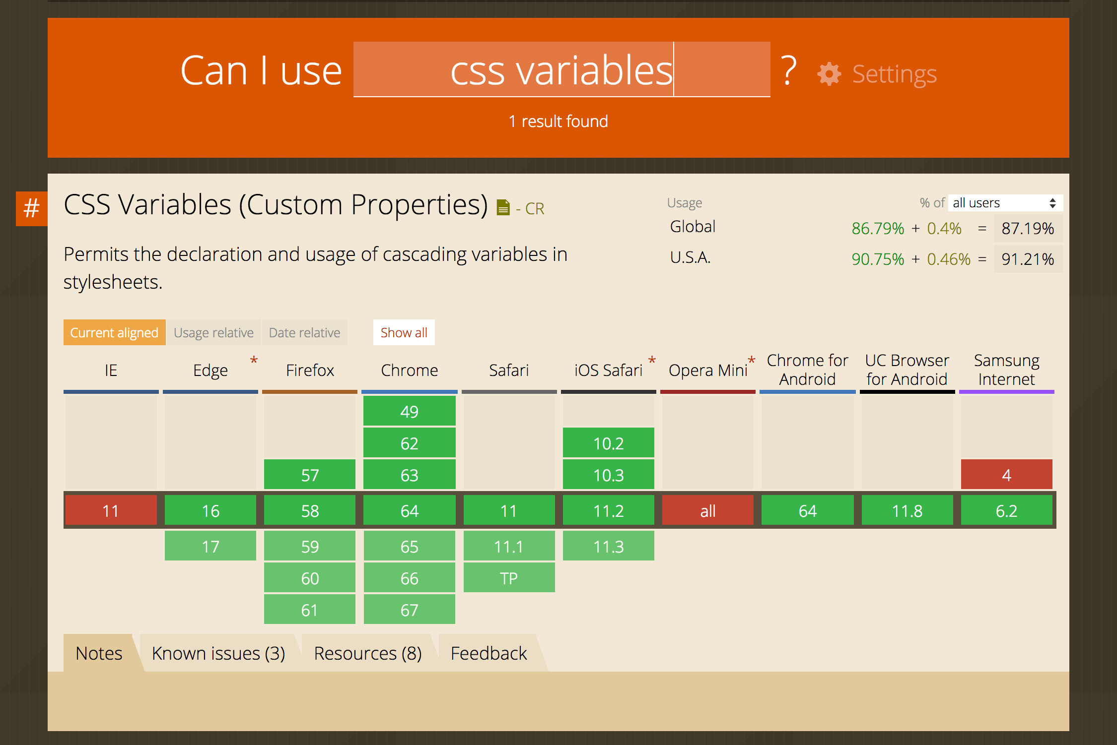
As with any new feature, browser support is key. Fortunately, as of this writing, there’s very little to be wary about as far as using CSS variables right away; the only major browser without support is Internet Explorer 11 (and lower):

Global support is near 90%, with IE11 and Opera Mini (which seems to have many gaps in support) making up the vast majority of the remaining 10%.
But this post will age, so you can check caniuse.com for up-to-date stats on browser support for custom properties (CSS variables).
Right now, I personally wouldn’t hesitate to use CSS variables in production; that’s hefty support. But it will depend on your site’s users. If some are likely to be on IE11, I’d definitely recommend using fallback values for custom properties, like so:
h1 {
	color: #53565a;
	color: var(--brand-primary);
}
But regardless, I hope you’ve enjoyed, and have fun with using CSS variables in your next project!